Project information
- Skills Showcased: Data Wrangling, Data Cleaning and Data Visualization
- Tableau URL: LINK
Netflix Streaming Dashboard
Introduction:
This dashboard showcase utilizes a fictional dataset from publicly available data on Netflix from Kaggle. It demonstrates proficiency in data wrangling, data cleaning, and data visualizations,
showcasing the application of these skills in real-world contexts. Employing tools such as KNIME, Excel, and Tableau, this project provides a practical demonstration of handling data challenges and creating insightful visualizations.
Data Gathering and Steps: Data sourced for this dashboard included Netflix Streaming Data and Netflix User Data. To process the data, I used KNIME to import the CSV files, rename data headers, remove unwanted columns, and generate random streaming numbers, given the initial data from Kaggle lacked. Finally, I consolidated the two datasets into a single Excel file, with them on separate tabs for Streaming and User data. See KNIME data processing here!
Dashboard Features:
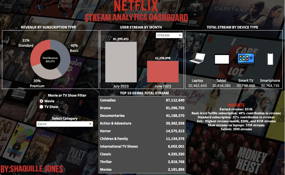
- Pie Chart: Ease of reference in showcasing the distribution of revenue earned from various user subscription levels.
- Bar Chart: This dynamic chart not only offers a breakdown of revenue of the months but also allowing user to pivot and analyze streaming data across July 2023 and June 2023.
- Device Type: Was selected to gain insight into user trends regarding their devise preference for watching Netflix.
- Data Table: Was chosen to enable users to explore various dimensions of the data, such as top streaming trends across countries, genres ratings and even showcase to shows/movies that were top streamed.
- Insights: These were chosen to provide a quick takeaway starting with breakdown of revenue, then a further deep dive of primary drivers of revenue including subscription type, the comparison between June and July for historical context. Additionally, insights related to steaming trends were included to offer a look into user habits such top/low months with a layer of user device preference.
Benefits: This dashboard, when customized for business applications, excels in presenting detailed information while emphasizing user interactivity and historical trends. Leveraging KNIME processes, it seamlessly integrates disparate datasets and generates synthetic data, including user streams, to enrich analytical capabilities and provide a comprehensive view of business operations.


