Project information
- Skills Showcased: Data Wrangling, Data Cleaning and Data Visualization
- Tableau URL: LINK
Netflix Streaming Dashboard
Introduction:
This dashboard showcase presents a fictional business scenario, leveraging publicly available data on Kaggle to demonstrate proficiency in data wrangling,
data cleaning, and data visualizations. Utilizing tools such as KNIME, Excel, and Tableau, this project illustrates the application of these skills in real-world contexts.
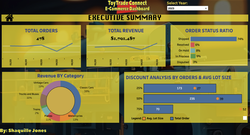
Business Case: ToyTrade Connect, a B2B company sells a variety of collectible toys worldwide. Owner Andy Davis has limited time and struggles to see all business data in one place due to their scattered tech setup. He wants to track yearly performance and shipping status easily. Andy plans to expand the product line but needs to know which toys bring in the most revenue. He also offers discounts at 25%, 50%, and 75% off and wants to know which ones result in more orders.
Problem Statement: The challenge arises from the scattered nature of data across multiple sources, compounded by inconsistencies in data formatting. This supports the importance of implementing robust data governance processes, data consolidation efforts, and identifying key performance indicators (KPIs) presented in an executive manner to assess performance effectively.
Solution Overview: The dashboard presented below aims to accommodate Andy's time constraints while delivering easily digestible information. To achieve this, KNIME was employed for data cleaning and column reformatting, ensuring readability for Tableau.
Dashboard Features:
- Total Orders and Total Orders Month-over-Month Trends: These KPIs offer a quick performance overview, including Month-over-Month trends for a selected year. Additional insights are available through tooltips when hovering over each data point.
- Order Status Ratio: This horizontal bar chart provides a breakdown of shipping statuses for the selected year, alongside their respective ratios of total orders. and analyze streaming data across July 2023 and June 2023.
- Revenue by Category: Presented as a Donut Chart, this visualization illustrates revenue distribution across product categories. Hovering over each section reveals total revenue, top merchants associated with the category, and revenue breakdown.
- Discount Analysis by Orders and Lot Size: This section offers a comparative analysis of different discount offerings using a horizontal bar chart. For easy comparison, it includes average lot sizes and total orders associated with each discount tier.
Benefits: The dashboard offers Andy and other ToyTrade Connect executives actionable insights to pinpoint past revenue and order trends through line graphs. Additionally, it empowers them to analyze the shipping status ratio, enabling the identification and mitigation of gaps contributing to a drop in shipping ratios between 2022 and 2023. Moreover, beyond these benefits, the dashboard fosters informed decision-making, supports strategic planning, enhances operational efficiency, and ultimately drives business growth by providing a comprehensive overview of key performance indicators and trends.


